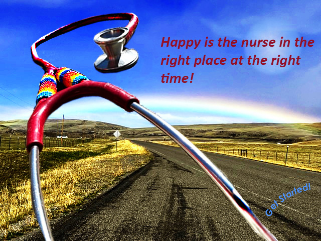
I received almost unanimous recommendations to change the font color to either match the stethoscope or another color within the image. I wholeheartedly agree. My original color choice wasn’t my favorite, but nothing except an extreme yellow seemed to contrast with the color of the highway such that the text would at least be legible. I don’t know why I didn’t think to simply move the text from the bottom of the image into the sky before the critiques–likely I couldn’t do that because the sun was there, hogging up the space, which was another point well taken.
The comments collectively allowed for many improvements. I reduced the sun’s size and muted the brightness. This move allowed the viewer’s attention to be drawn to the stethoscope and rainbow–the more meaningful elements of the image. Reducing the size of the sun created space in the sky for the text, allowing for me to choose a legible, more desirable color for the text.
I also obsessively worked on the stethoscope–simultaneously ruining the entire image and restoring it. I edited it, unfortunately, in the destructive mode. I now have at least 20 versions of this stethoscope, which was no big deal other than a bit confusing at times. I would like to use the next assigned task to really drill down on how not to do that ever again.
I did more blurring, color matching, and sharpening to the edges of the scope. I also adjusted the hues a little more–I could likely keep fooling around with the hues until kingdom come.
I did figure out how to “heal” (with the Photoshop healing feature) the stethoscope in the bottom right corner. In my earlier version, the text sort of obscured the fact that part of the scope was missing. The healing feature of Photoshop is super cool and I think it did a great job.
Another suggestion from a peer was to consider “what is the point of this page” type deal. I added text in the bottom right corner to suggest that this would be a gateway to find out more information about traveling. The text “Get Started!” would be a hyperlink that would lead to a checklist on what you need to start traveling.
I’m really pleased with this exercise. While at first I lost my mind, I was able to really learn a lot about Photoshop. I enjoyed creating something that I could present to peers, and I REALLY appreciate and enjoyed their comments and suggestions. We are all so busy–the fact they took the time to give such thoughtful responses was a true gift and I took their suggestions to heart. The entire project in terms of skills learned, feedback, and this creative process was very meaningful for me.

Leave a comment