
Thanks for the tips!
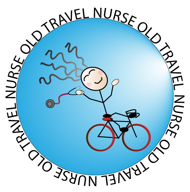
Sooo! Lots of changes to my girl! Per all of the wonderful suggestions: I removed a redundant line on the bike and dragged down her rear end so that it was “sitting” on the seat; it does make her bottom bigger but I thought that went along with the Old Travel Nurse’s authenticity.
I added not only wrinkles to her eyes but laugh lines around her face. I reduced the stroke around her face and her eyes. I also gave her more hair and changed it’s position slightly. The changes made her face appear to be facing more towards the viewer.
I moved the light gradient up so that it appears the sun is up in the sky shining down on her face.
Originally, I had thought to make the background an actual globe, but I was not able to successfully freehand recognizable continents. I did pick a water-globe blue. Ebany suggested the idea of continents again, so I tried again (I would have reduced the opacity of the continents to a subtle background). In the end, I just continued to struggle with decent continent shapes. I kept the same blue color but changed the stroke color. I thought it gives the circle a more 3D “globe-ish” effect.
I simplified the text around the circle, per all suggestions, and changed the font to one you may see on a map.
I added an ear piece to her stethoscope because not having one drove me crazy. I enlarged the picture significantly, which worked wonders in manipulating very small details.
As what Pepsi did, my “intent is not a singular message. It’s what the smile means to you..” The graphic is meant to be happy.
I followed Aaron Draplin’s process of sketching out a few ideas, transferring those ideas onto the computer, and then thinking about the message–making a logo that fit my personality, and the travel nurse theme. I tried out several ideas and put them to my public for a vote–which was fun.
I really liked Dan Scott’s step of transferring a drawing into Illustrator to use as a template. It did occur to me that drawing in PowerPoint first was a redundant step–Illustrator could have handled what I wanted directly. At the time I was just so much more comfortable in PP–it was faster to do it that way. Illustrator leaves PP in the dust and would be my go-to moving forward for image projects.
Leave a comment