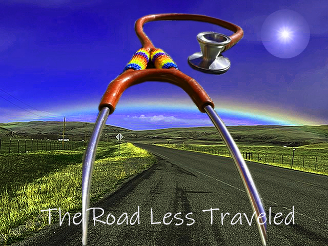
I am posting two pictures to demonstrate what I have learned over the last week. First I will describe the images and overall design, and then I will tell you why I posted both shots and the difference between the two.
The main landscape picture (background) of the road and rainbow was taken by me, using my iPhone 13, in the Spring of 2022, outside of Heart Butte, MT, where I worked in a small, rural clinic. It had rained lightly earlier in the day, and as I rounded a corner driving in my truck, I suddenly saw the rainbow arching over the road. By using this image, I hope the viewer experiences some of the same happy surprise I had that day.
The stethoscope is my personal stethoscope, originally gifted to my by my mom when I first graduated from nursing school. A woman I met working on the Blackfeet Indian Reservation did some beading on it. This week, specifically for this class, I took it outside, laid it on top of concrete blocks, and took a lateral shot with my iPhone 13. I made sure the Littman logo was down so as to not violate any rules about showing a brand name.
I used the same technique as we learned in the Murrow Hall tutorial to cut the stethoscope shape out and lay it on the background. I referred to the tutorial video several times to get the steps correct. I used the image rotation features to move the stethoscope around to see if any particular placement had an emotional effect for me, and when it did, I landed it on the background.
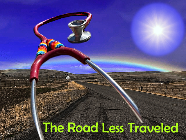
From the Adobe Photoshop for Beginners tutorial by Daniel Walter Scott, recommended to me by our teacher, Mr. Jameson, I began by first playing with the hues and saturation especially of the background image. I changed mostly the blues and yellows, and added saturation (link to the tutorial below).
I had an hour long 1:1 tutorial with Mr. Ron Price, who teaches an undergrad version of this class (as I understand it) at WSU, and who was generous enough to spend so much time with me.
After hours of watching Daniel Walter Scott’s tutorial, the session with Mr. Price, and much practice, I learned new techniques enough to rework the first try. The 2nd try involves a more controlled use of hues and saturation, using the color replacement tool, blurring and sharpening the edges of the stethoscope, and a redo of the font type, size, and color.
For a third image, I downloaded a free image from Pixabay. My first attempt to cut out the bright sun to use in my image was successful but inexplicable–I have no idea how I managed it. Now I can control and reproduce cutting out shapes (seen in the 2nd image). I was able to use the elliptical marquee tool with shift + and holding the mouse to control my shape (cutting the circle), transform (control + T) and scale features, control + and control- to zoom in and out. I was able to change the hue and brightness. I thought I would have to blur the edges on the sun as well but decided it didn’t need it.
I was concerned about using images that were copyrighted and reluctant to use them. I want to share a common easy to use resource: Beautiful Free Images & Pictures | Unsplash that was shown to me by Mr. Price.
While I used specific elements in Photoshop to effect the photos and elements of the overall image, I also considered the the overall emotional effect of my final image. The eye is tricked into physically moving down into the image, while the mind is simultaneously trying to figure out what it is seeing. Gestalt’s principle of hierarchy (with continuation) states “the viewer is guided towards the most important elements.”
Hopefully the picture has the effect of happy surprise. The content is relevant to Nursing, travel, and lends itself to the overall content of my blog.
Originally I posted the image on the left a couple of days ago. I was grateful at that point to have at least ‘something’ to turn in! I have never worked with Photoshop before and was completely despairing–the details of which I am leaving out here but honestly the stress nearly had me quit this program entirely. After all of the extra tutoring and study, I came up with the image on the right and uploaded it today (1/26/22). There is hope! The main take away is that if you ask for help, you will get it. I truly thank Mr. Jameson, Mr. Price, Mr. Jeremy, and Mr. Scott for helping me get through this experience!
I still have a lot of work to do and look forward to your insight.
Addendum 1/28/2023: This addendum is obviously late. After reading everyone else’s work and the requirement again, I realized I hadn’t properly referenced the sun I used from Pixabay. https://pixabay.com/photos/sun-sky-blue-sunlight-sunbeam-3588618/
8 responses to “Draft Graphic Design Project”
-
Hi Kathleen,
Kuddos to you for all your hardwork and sticking through with completing your graphic! This was also my first time doing anything with photoshop, and it felt a bit daunting for me as well. The emotional aspect and intentionality around the design of your graphic really does shine through. The background picture is beautiful, and I love the similarity between the rainbow and the colors of the beads on your stethoscope. The colors of your second image does seem controlled yet still vibrant, and feels more grounded in what we would actually see if we had the chance to see this place in person. I believe these are the strongest aspects of your graphic.
One creative suggestion I had was changing the color of the text to match one of the colors from the photo you took. This could be a color from the sky, grass, sign, or even the fence, whichever one that will pop out enough to be seen yet hold similarity due to the coloring. I believe you could achieve this by using the coloring tool to match the coloring from a pixel in your image to the text when you choose to change the text color. Perhaps utilizing the color of the sky may provide almost like a reflection between the sky above and the text on the road. By doing this, you would also achieve the rule of three by having that blue in the text, the sky, and the rainbow.
Another suggestion I had was scaling down the size of the sun and perhaps utilizing the transform tool to fade the edges of that image into the background even more. I feel as though the scale and placement of it currently almost takes away from the main image and stethoscope. It does make sense to have the sun in your image, because it’s needed to make such a beautiful rainbow of course, but I think that having it as an image that complements the background rather than having it be a third “focusing” image would better convey your goal and intentions of the graphic.
LikeLike
-
Thank you so much for your critique! I feel like everyone is exposing my weaknesses so well and it’s so funny to me. Argh! You are right about the text–I need to go back and rework it. Thank you for the suggestion about the sun–it is big. I was so happy to have the sun cut and in the right spot I was like, whew! But I do have more experience now and feel like I don’t have to panic about something disappearing in the the abyss. I look forward to reworking my image with these suggestions!
LikeLike
-
-
Frances, I loved viewing your design and reading about your process. I think the framing that you have with the stethoscope and your message is really well done, and your ability to fill the frame in the second design was really good as well. The only two critiques I would say would be, have to deal with your text. I don’t know if the phrase has a specific meaning in your day to day life in your career, but “The road less traveled” can definitely be considered a cliche, so maybe if there is a different phrase you could use that could hold more weight or could have a clearer message that can tie together the image of the stethoscope and the road and the sun. I would also maybe play with different colors for the text (maybe the red from the stethoscope would help tie those elements together. To me, the green seems a bit distracting. Overall, great work! Can’t wait to see the final product.
LikeLike
-
I didn’t realize I could respond back to you here so sent you an email. This is definitely a learning process for me! Thank you for your awesome critique!
LikeLike
-
-
Hi Kathleen,
I love your creativity and honesty in your image and your blog post. Kudos to you for your use of your own photography. I like your use of Gestalt’s theory of similarity by repeating the use of arches in your composition, with the arch of the rainbow and the arch of the stethoscope, even the way the road bends. It provides a sense of harmony that contributes to the overall unity of the image.
In looking closely at the stethoscope, I’d suggest addressing how the right part of the stethoscope ends. While it is blurred, it is somewhat abrupt. You could try moving the text to cover this end, it might make the end of it blend more naturally. I’d also suggest taking a look at the edge of the stethoscope on the right side where the red rubber meets the metal. It looks like you can still see some of the original background. You might try blurring the edge to hide some of that background coming through.
For the text at the bottom of the page, I’d suggest adding a sub-header to make it clear what this graphic will be used for, is there a call to action for your audience? You could adjust your blog post to outline the purpose of this image. I think you did a great job using this image to evoke emotion in your audience, I definitely felt happiness when looking at the beautiful rainbow. Is there a more practical use for this? Would you use this as a poster or advertisement for something?
Thanks again for your thoughtful post and sharing your process. I commend you for reaching out for help and showing how your work has progressed already!
Molly
LikeLike
-
Thank you so much for your insight! I agree that the text needs to be reworked. I thought about how this may be a page that would link to a checklist of professional documents I needed to get started with a travel agency-knowing what is needed might encourage other nurses towards stepping towards traveling by understanding more of what is involved.
LikeLike
-
-
Hi, Kathleen-
I promise you I can absolutely relate to your Photoshop struggles. It’s my first time with the program as well. A few nights back I was actually having bad dreams about it- the photos kept stacking and unstacking and wouldn’t stop.
It sounds like you’re using this as a blog cover photo. I like it! I agree that it really seems to represent you well. The base photo you’ve treated with color is bright and feels like an adventure all by itself. The stethoscope is obviously an important symbol for you, and the beading you’ve featured illustrates your travels and your vocation in a beautiful way. As for suggestions, it’s possible that the size is off for the use you have in mind, so you might want to double check that. Also, I think the sun may have been a bit of a distraction for me in the overall piece. I’d love it if the photo included you holding the stethoscope, to focus on you a little more, but of course I would not really know how to do that.LikeLike
-
Thank you so much for your feedback and suggestions! I appreciate you!
LikeLike
-

Leave a reply to sbarlow1215 Cancel reply